Last month, I shared some advice for selecting the perfect website template for your business. Today, let’s take it a step further and talk about those special touches that will make the template look and feel custom. Oh yessss, it’s possible…
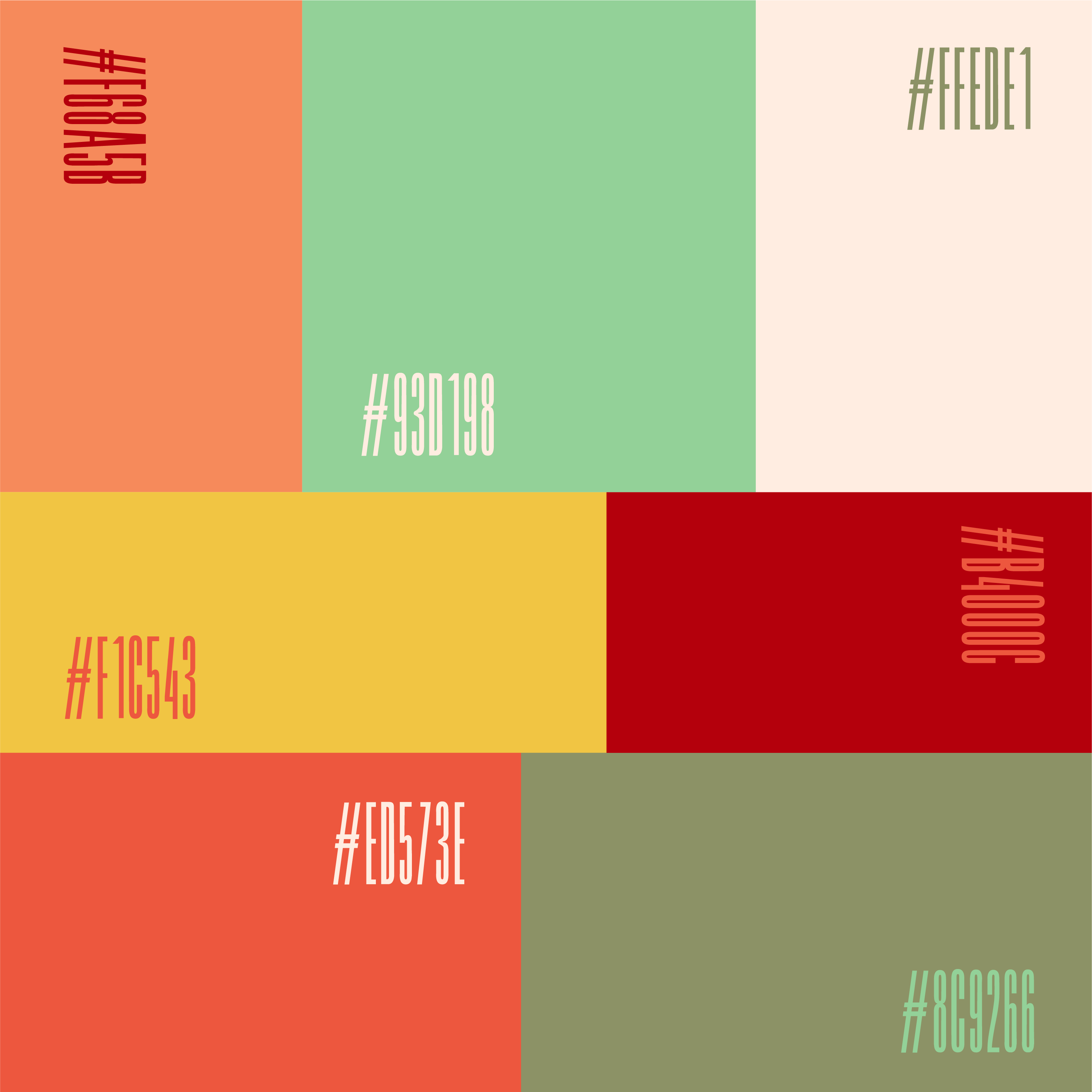
Step 1: Start with a plan & your brand
A big part of customizing your template successfully is having a plan before you start. Not having a plan is kind of like trying to get somewhere you’ve never been before… with no directions and no map. Who knows where you’ll end up!
“That’s great, Ariel, but how do I plan to customize a website template? Isn’t it supposed to be planned for me?”
Great question, and you’re partially right. You do want a website template that ticks as many boxes as possible for your business. But once you get to the customization part, you are the one in the driver’s seat. How do you know where you’re going?
It starts with your brand… and you and your clients are the beating heart of that brand. Ask yourself:
- How do you want your audience to feel when they engage with your brand? Relaxed? Excited? Empowered?
- If your business had a personality, what would it be? Would your ideal audience be attracted to that personality? Why or why not?
- How can the colors on your website express those feelings? Do they need to be bold and confident? Soft and approachable? Earthy and grounded?
You get the idea — and this is the fun part! Once you have answered these questions, they become your destination. Now, you can move on to narrowing down the color palette itself…

Step 2: Use images for color inspiration
My favorite first step for creating a color palette is to find an image (or multiple) that already has all the right colors and feels. This can be any image, something you found on Pinterest, a photo from your actual life, a glossy print from a magazine, anything. If it matches all the ways you want your brand to feel, you’re onto something, girl!
You can then upload that image to a color palette generator like this one that will pick out the colors within the photo. Of course, every photo has hundreds of different hues and combinations, so play around with it until you find a color palette or two that feel just right.
Indecision alert? If you’re having a hard time narrowing down your choice to just one image, create a Pinterest board full of colors you like and pull from several images! No sweat.
You’ll know you’ve landed on the right color palette when the colors are in line with the questions you answered in Step 1 AND you feel good about it. If you feel split between a couple options, ask yourself: Which one would your audience be drawn to most? Which one will still reflect the brand in 6 months from now?
Step 3: Set your brand’s color palette
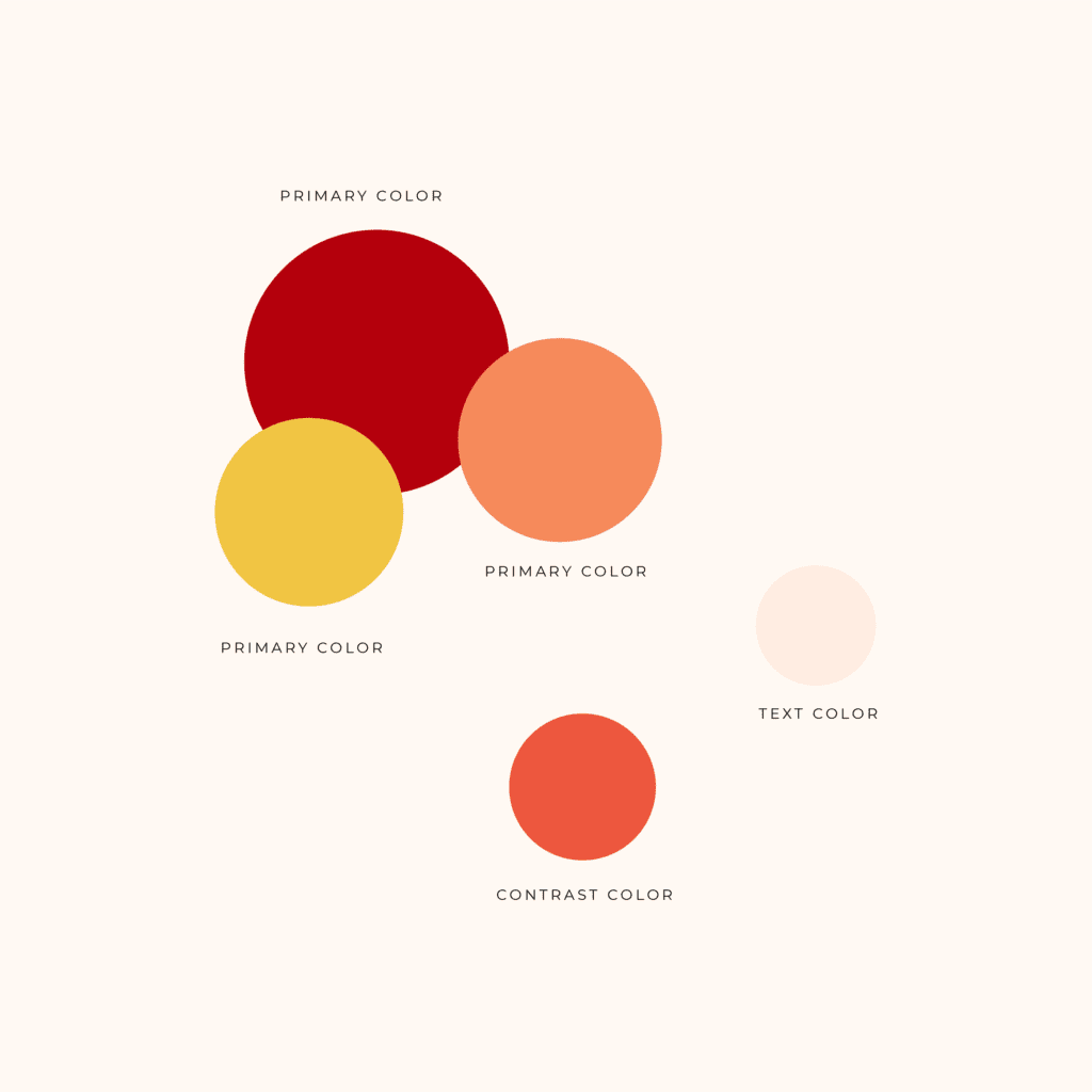
“Wait, didn’t I just do that?” Yes… and no. You may have settled on the hues that will make up your color palette, but incorporating them into your brand and website is an additional step. You have to decide which hues to use where, and each will have its own role. Here’s what you’ll need:
1-3 Primary Colors that form the heart of your brand
1 Contrast Color that stands out and can be used for buttons, link hovers, etc.
1 Text Color to be used for long sections of text, typically a darker color for readability
1 Background Color for sections of your website, typically a lighter version of one of your primary colors
Once you have given your brand colors their various roles, implement them into the website template! Most templates come with tutorials that show you where and how to personalize various settings and sections of the website template (it varies by site and design), so I’ll skip that part for now. You got this!
Step 4: Find photos that reflect the color palette
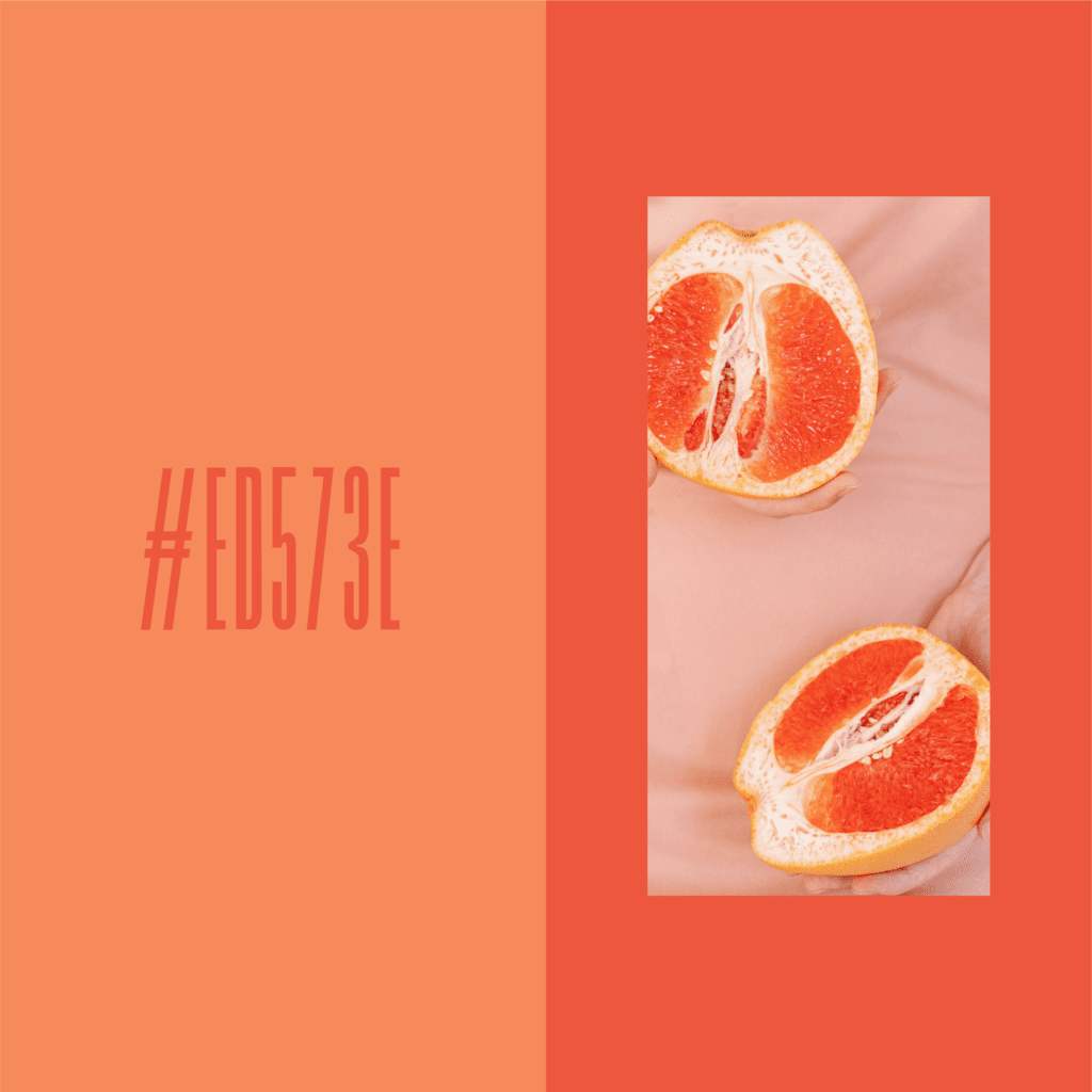
Bet you didn’t think there was a fourth step, did you? Since you will very likely be swapping out the template’s preset photos, it’s important to keep your color palette in mind when making image selections. This extra layer of detail makes everything feel branded and cohesive — and helps a DIY brand feel custom!
To do so, make sure that the colors and editing style in the photos reflect the same color palette you’ve chosen. For example, you could also use a filter to give all of your images a similar, on-brand cast (try Canva or VSCO). It won’t work for every photo out there, but it should work for most.
If you’re not sure where to look for photos, there are plenty of stock photo resources just waiting for you. I recommend some great stock photo resources here.
Last but not least, have fun customizing your website template! It shows. 😉
Don’t have your favorite website template locked in just yet? I’ve got your back. Check out our suite of template designs, uniquely inspired by my travels around the world.
xx,
Ariel

